A small but important redesign of BMO’s Security Hub UI and user flow within their mobile app.
If you’ve ever been the target of banking or credit card fraud (I have), you know the sick, panicky feeling it produces. Fumbling through your cards, desperately searching websites or apps for the right number to call (if you aren’t put on hold) or button to push in a desperate race against time before the thieves max out your cards or empty your accounts. Every second literally counts and the app should make this feature prominent and effortless to use.
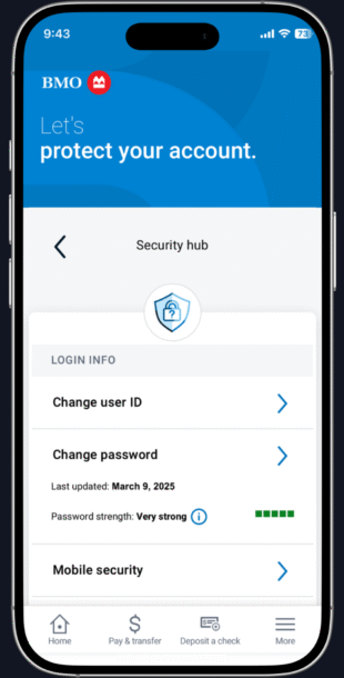
As a former customer of BMO and a UX designer building a portfolio, I decided to explore a limited redesign of their in-app security features and user-flow as well as give the general UI a “refresh” without straying too far from their current design. To it’s credit, BMO does have a “Security Hub” in their app where you can lock your accounts, but it’s buried under too many layers of menus and unhelpful descriptions and only applies to the user’s credit card, not their other accounts. My goal with this project is to improve the usability of the Security Hub and also to make a few improvements to the UX/UI of the app in general since I find it a bit clunky.
I interviewed several people I know and a few strangers to see if they knew how to access the security lock features within their banking apps (some were BMO, some were various other banking apps). The overwhelming majority of people could not easily access these features and some apps did not have them at all. Nearly all of them told me they would appreciate a more prominent, visible location for this feature within the app they use.
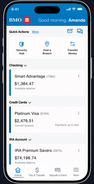
The current BMO app locates the security functions within the “More” settings option, and there is no mention of it in the “Quick Actions” section at the top of the home screen. This important feature should be more prominent and easier to initiate.
- I recommend that the Security Hub (and the “Locate a Branch” feature while we’re at it) links be added to the expanding (More) Quick Actions section at the top of the home screen of the app. They have thoughtfully already implemented the ability for the user to re-order these “quick links” so they can place them at the top if they wish.
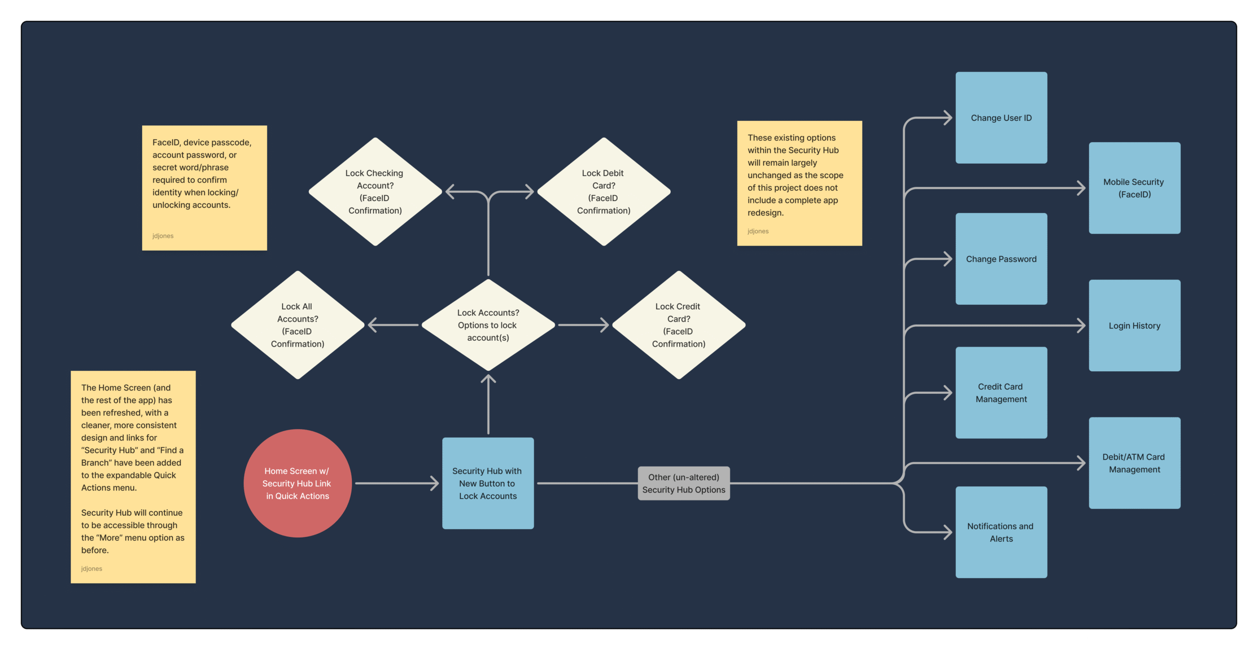
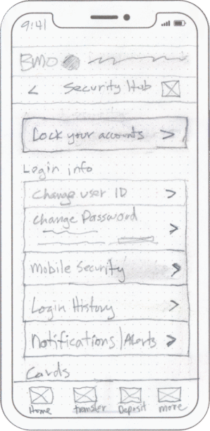
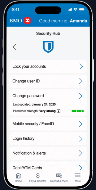
- The Security Hub screen would have all the current standard security features such as password changes, Face ID activation, etc. as well as a button that leads to a screen where the user can lock down their accounts.
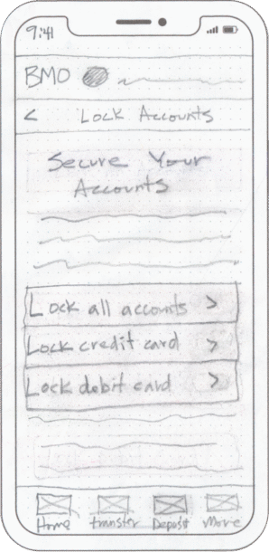
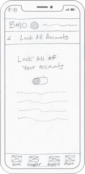
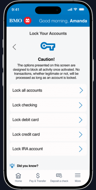
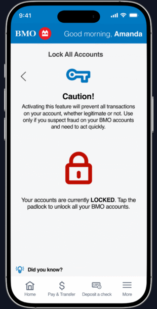
- Crucially, this screen also has an option for instant lockdown of all their accounts if there is great need for immediate action. It would be followed by a confirmation screen where the user could quickly confirm this action.
- The individual account lockdown options give the user more granular control with the option to lock down only the compromised account if they wish.
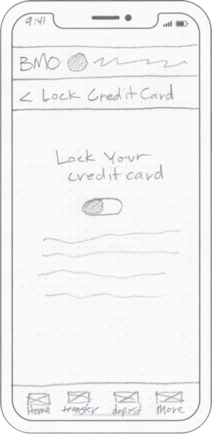
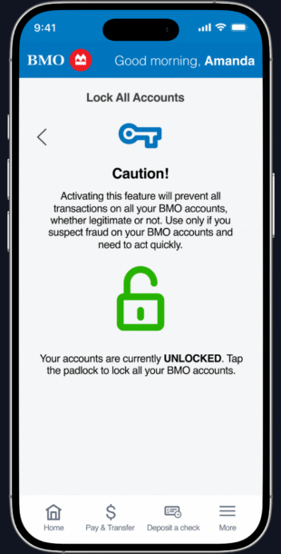
- The next screen shows a toggle button that would allow the user to lock a given account.
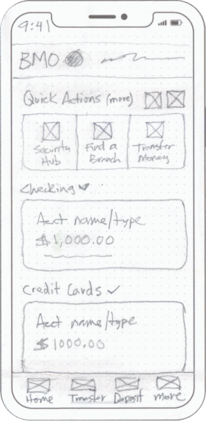
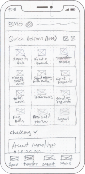
I began the design process on paper as I find it a comfortable, fluid way to explore ideas and processes. It’s amazing how useful and versatile paper, pencil, and eraser can be even with all the digital tools we have at our disposal.
I initially planned to have an on/off switch for the account lock function, but realized at this early stage that this would be confusing: does “on” mean it’s locked or unlocked? I instead opted for a much more clear “padlock” icon in the final design.
The Ui for this app seems to be all over the place with little consistency and the Security Hub is a good example of this. More than 50% of the visible screen on my device serves little to no function at all. Working within the general design direction of the existing UI, I was able to bring more consistency with the rest of the app and better utilization of precious screen real estate.
In my opinion this app lacks consistency and feels sort of cobbled-together when I use it. A full redesign falls outside the boundaries of my goals with this project (to simulate the process of updating part of an existing app while keeping the design consistent and functional with what is already there). However, I couldn’t resist providing a few updates to the general UX/UI.
Mostly, this amounted to moving a few things around to create a more consistent feel as well as addressing their near-criminal abuse of precious screen real estate. More could certainly be done with more time and resources, but even with my minimal interventions the app feels more consistent, polished and trustworthy.
I built a prototype to demonstrate the new UI, security features and updated user flow for the Security Hub in BMO’s mobile banking app. There could be further refinements with more user testing but I feel that this represents a significant step forward in usability, aesthetics and functionality.
This app needs a complete redesign in my opinion. It works ok most of the time, but I always feel a certain disappointment when I use it. I have other projects planned or else I might be tempted to go for it. But for now I feel the updates I have provided here are pretty satisfying and contribute positively to both the aesthetics and usability.